Color Temperature Essentials for Outdoor Lighting
“Light is memory,” a designer once said, and the right color temperature can rewrite a yard’s mood after sunset. For a harmonious outdoor light color, balance warmth with clarity so spaces feel welcoming yet precise. In South Africa, dusk has its own storyteller’s glow, guiding mood as the night comes alive.
Three broad families guide choices:
- Warm 2700K–3000K — inviting ambience for terraces
- Neutral 3500K–4100K — versatile for stone and greenery
- Cool 5000K–6500K — crisp clarity for paths
The rhythm of light across the landscape should feel purposeful, never overpowering—an invitation rather than a shout in the night.
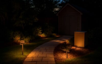
Warm versus Cool Outdoor Lighting for Different Zones
South Africa’s dusks carry a storyteller’s glow, and the right outdoor light color writes mood into the evening air. “Warmth invites, clarity guides,” a designer observes, and balanced warmth and brightness can turn terraces into living rooms after sunset while keeping stonework and greenery legible.
The outdoor light color for each zone should balance warmth with clarity.
- Terraces and entertaining spaces: Warm 2700K–3000K for hospitality.
- Paths and transitions: Cool 5000K–6500K for crisp guidance.
- Gardens and architectural features: Neutral 3500K–4100K for versatility.
Across a South African landscape, the rhythm of light in these zones should read as invitation—not shouting into the night—and the result is evenings that feel intentional, generous, and enduring.
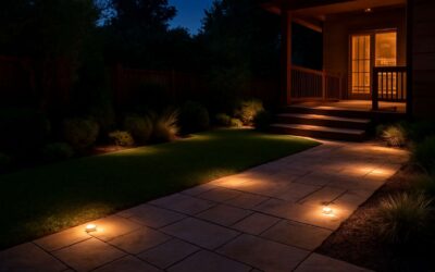
Color Rendering and Realistic Ambience Outdoors
Color is truth in the dark, and South Africa’s dusks prove it. The right outdoor light color doesn’t just light a space—it reveals textures, plants, and stone as they truly appear. A high-CRI glow makes reds pop and greens breathe, turning a terrace into a stage after sunset.
Real ambience hinges on color rendering. CRI measures how faithfully a light source reveals colors; the higher, the more natural the scene looks. This matters outdoors where shadows, foliage, and masonry meet. The outdoor light color you choose should harmonize spectrum and texture so that walls read softly and plant life remains vibrant.
- CRI and R9 matter for red and blue hues in fabrics and brickwork.
- Balance spectral content to avoid washed-out greens.
- Consider how the color rendering interacts with your zones and materials.
Done well, the scene holds its character from dusk to late evening, inviting linger and conversation.
Practical Planning: Selecting Outdoor Lighting Color Across a Property
Evening-proofing a South African garden starts with a choice—one that might feel subtle but reshapes the entire scene. A measured approach to outdoor light color can reveal stone textures and plant silhouettes as if they were carved in moonlight. A single hue, chosen with intention, threads the spaces from veranda to poolside into one cohesive nocturnal tapestry.
- Zone function: entry, seating, and pathways
- Material harmony: stone, brick, wood, and metal textures
- Field testing: walk the space at dusk with a tester and refine
Measured decisions ripple through borders and hedges, guiding guests along the lawn with quiet confidence and inviting lingering conversations long after sunset.

0 Comments